
TL;DR
Ideal Home contributor Grace H says homeowners can make rooms feel more collected by breaking up matching furniture sets, adding varied finishes and layering colour. Her advice is to use a favourite cushion, artwork or rug as a starting palette rather than aiming for exact matches.
Home decorator Grace H, a new contributor to Ideal Home’s Open House series, has shared advice on making interiors feel more personal by moving away from matching furniture sets and rigid colour schemes. Her recommendations include mixing materials and finishes, adding colour beyond a two-shade palette and using a favourite cushion or artwork as a guide.
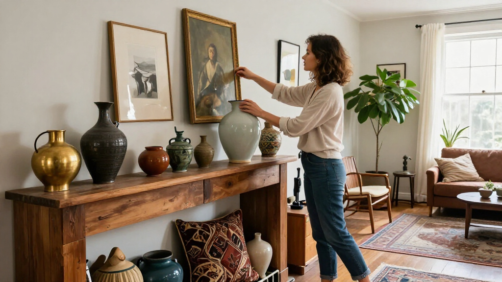
H’s central point is that a room does not need to look as if every item was bought together. Rather than replacing coordinated furniture, she suggests moving pieces between rooms to break up a matching set. A farmhouse dining table paired with more modern chairs, or bedroom drawers in a different finish from the bedside tables, can create contrast without requiring a full refurnishing.
She also advises combining finishes, including different metals such as brass with chrome or bronze with nickel. In her view, varied materials, textures and finishes help a space feel less like a showroom. The guidance is not to buy a new collection of contrasting items, but to work with what is already in the home and add variety gradually.
On colour, H says a room can build on an initial pair of shades without being limited to them. Her own office combines peach and mint green with yellow blinds, a red sofa and a pink artwork frame. She presents that mix as an example of using distinct colours to make a space feel playful and individual, not as a formula that every home should copy.
A Lower-Cost Route to Individual Rooms
The advice offers a practical alternative to treating a room makeover as a shopping list. Rearranging existing furniture and changing how pieces are paired can alter the room’s appearance without discarding a coordinated set. H explicitly cautions against throwing everything out, noting that the aim is to make decorating easier and avoid unnecessary waste and work.
For readers overwhelmed by competing interior trends, her approach gives a starting point rather than a strict style prescription. Instead of trying to reproduce a particular look or make every element match exactly, homeowners can keep a colour or object they like and build around it. The result will depend on personal taste and the items available; H’s examples are decorating guidance, not evidence that one arrangement suits every home.
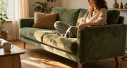
The broader takeaway is that coordination can come from repeated colours, materials or details rather than identical products. A room may feel connected even when its furniture does not come from the same range. That distinction matters for people furnishing gradually, using inherited or second-hand pieces, or wanting a home that reflects more than one buying moment.

Mixed Color Mosaic Tiles, Craft Glass Pieces Set, 1100 PCS Decorative Mosaic Art Supplies for Home DIY Projects, Jewelry Making, Home Decoration And Creative Design Use
- Versatile Mosaic Applications: Suitable for home decor and crafts
- Durable Glass Materials: Vivid tones and long-lasting quality
- Smooth Edges and Polished Finish: Safe for children and detailed projects
As an affiliate, we earn on qualifying purchases.
As an affiliate, we earn on qualifying purchases.
From Matching Sets to Mixed Pieces
H frames the advice through a change in decorating expectations. She recalls growing up in the 1980s with the idea that cushions, lampshades and decorative objects should match a chosen scheme exactly, ideally bought from the same shop. She says current social-media interiors can send conflicting signals: one post may encourage eclectic combinations, while another appears to prescribe a specific set of purchases.
Her piece responds to that confusion with a handful of methods rather than a single required aesthetic. For colour, she points readers to the colour wheel: adjacent shades such as red, orange and yellow can form a harmonious scheme, while opposite colours such as red and green offer more contrast. Three colours spaced around the wheel, such as red, blue and yellow, are another option. She also suggests using several tones from one colour family, such as pale pink with raspberry or baby blue with a deeper blue.
These are presented as ways to build confidence, not rules that must be followed. H says an unexpected colour can add interest, and refers to the “unexpected red” idea as an example of a small accent that seems out of place but can give a room character. The source article is a contributor’s personal decorating guidance, not a report on a formal design study or a market trend survey.

Viva Decor Maya Gold 45ml (Bronze) – Metallic-Acrylfarbe für kreative Werke auf Holz, Glas und Porzellan. Stoßfest, wischfest und wetterfest für glänzende Metall- / Metallic Effekte
- Color Palette: 30 metallic shades including blue, gold, silver
- Authentic Metal Shine: Provides genuine, radiant metallic gloss
- High-Quality Acrylic: Offers excellent coverage, quick drying, durable
As an affiliate, we earn on qualifying purchases.
As an affiliate, we earn on qualifying purchases.
No One Palette Fits Every Home
The article offers personal design advice and examples from H’s own home; it does not establish that mixed furniture or broader colour palettes will suit every room, budget or preference. It also provides no cost comparison, survey data or measured results about how these choices affect a home’s value or appeal.
H does not give a fixed number of colours or a universal test for deciding whether an unexpected item belongs in a room. The colour-wheel approaches are starting points, while the final choices remain subjective. The source does not specify its publication date, and it does not report a new product launch, policy change or other dated industry development.

KUNQIAN Kissenbezug Boho lila Kissen Hippie deko Geschenke für sofakissen kissenbezüge pfauenfedern dekokissen couchkissen kissenhülle Sofa Schlafzimmer Wohnzimmer Zimmer zierkissen 40X40 cm
- Decorative Double-Sided Design: Soft, breathable fabric, easy to clean
- Versatile Use: Suitable for home, car, office, and more
- Hidden Zipper Closure: Removable, washable, gentle machine wash
As an affiliate, we earn on qualifying purchases.
As an affiliate, we earn on qualifying purchases.
Try One Change Before Buying
For readers applying the advice, H’s suggested first steps are modest: move a piece of furniture to another room, pair a table with chairs in a different style, or introduce another finish. To develop a palette, choose a cushion, rug or artwork with several colours, then repeat less-dominant shades elsewhere in the room. Her own example uses one colour on the walls and another on the sofa, with further shades appearing in smaller details.
The next steps are therefore individual decorating choices rather than a scheduled industry milestone. The source provides no announcement of a follow-up event or additional guidance. Readers can test combinations with items they already own and decide whether the room feels more cohesive to them before making further purchases.

JORCEDI 3er Poster Aesthetic Schwarz Weiß Set, Geparden Wandkunst, Moderne Wandbilder, Fashion Leinwand Bilder, für Schlafzimmer Wohnzimmer Deko, Ohne Rahmen (40 x 50 cm)
- Stylish Room Decoration: Ideal for trendy and aesthetic spaces
- High-Quality Canvas Prints: Vivid colors and detailed imagery
- Versatile Indoor Use: Suitable for various rooms and settings
As an affiliate, we earn on qualifying purchases.
As an affiliate, we earn on qualifying purchases.
Key Questions
What does the “match-match” trap mean?
It describes coordinating furniture and accessories so closely that everything appears to come from the same set or follows exactly the same colours and finishes. Grace H recommends mixing pieces instead of aiming for identical matches.
Do I need to replace a matching furniture set?
No. H advises against throwing everything out. She suggests moving some pieces to other rooms or pairing existing furniture with items in a different style or finish.
How can I choose colours for a room?
H suggests starting with a cushion, rug or artwork that contains several colours, then drawing out shades from it for walls, furniture and accessories. The colour wheel can also help: adjacent colours create a closer scheme, while opposite colours create more contrast.
Do all the colours in a room have to match?
No. H’s advice is to create links between colours and repeat some shades across the room, rather than make every item an exact match. Her examples are personal guidance, so the final palette depends on the homeowner’s taste.
Source: rss